


The Happiest colour of all..
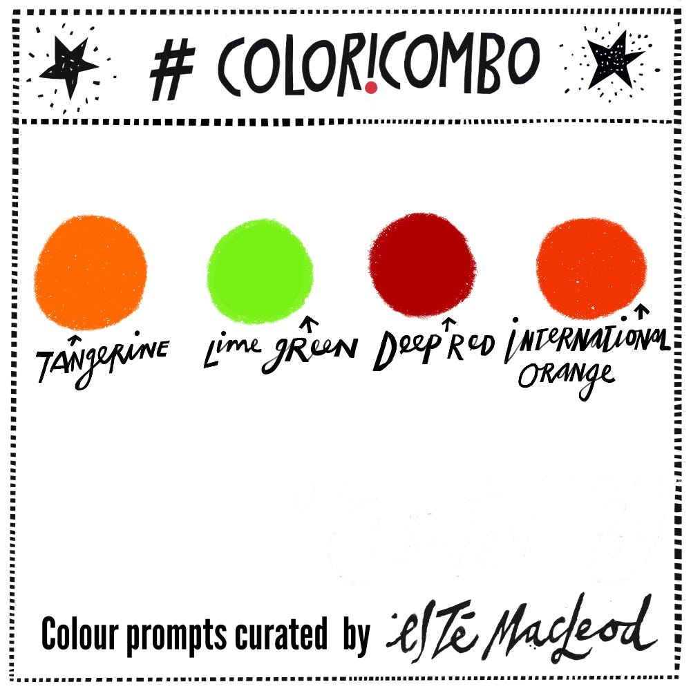
Week 5's colours are Tangerine, Lime Green, Deep Red & International Orange
This week’s colours are taken from a enamelled pendant in the shape of a house, given to me by a dear friend. I love it! Described as the happiest colour by Frank Sinatra, orange is the colour highlighted in this week’s prompt. A bright and positive colour is fitting to start off February, for many of us a grey and Wintery month. Orange has a fascinating history.
It sits between yellow and red on the spectrum of visible light and before the arrival of the fruit in Europe (~1500s), it was simply described as yellow-red. So the name of the colour is derived from the citrus fruit that came originally from China.
The English word comes from the Old French word orenge, itself derived from the Arabic nāranj and Sanskrit nāraṅga.
The colour symbolises energy and enthusiasm and is the national colour of the Netherlands. Orange is also has a strong religious connection. It is linked to Protestantism because of William of Orange, a Protestant who became king of England in 1689. Buddhist and Hindu monks wear orange-saffron coloured robes to symbolise renunciation, simplicity and enlightenment.

International Orange (Hex code #ff4f00)
Orange is probably the most visible colour and it’s high contrast makes it ideal for safety equipment and traffic cones. Life jackets are orange because the colour stands out against natural backgrounds such as the blue and green tones of water. It remains visible in low-light conditions, such as overcast weather or at dawn or dusk. This will also explain why inmates wear orange jump suits.
Before Cadmium Orange, made from cadmium sulfide in use from the early 20th century, artists had to rely on expensive minerals like orpiment and realgar to create orange hues in paintings.
The Golden Gate Bridge in San Francisco is protected against the elements with a distinct shade of orange paint known as International Orange. This was originally just a primer but was kept permanently to improve safety in low-visibility conditions. It’s also more resistant to corrosion and requires less maintenance than some other colours.
Read more about Orange here and here.
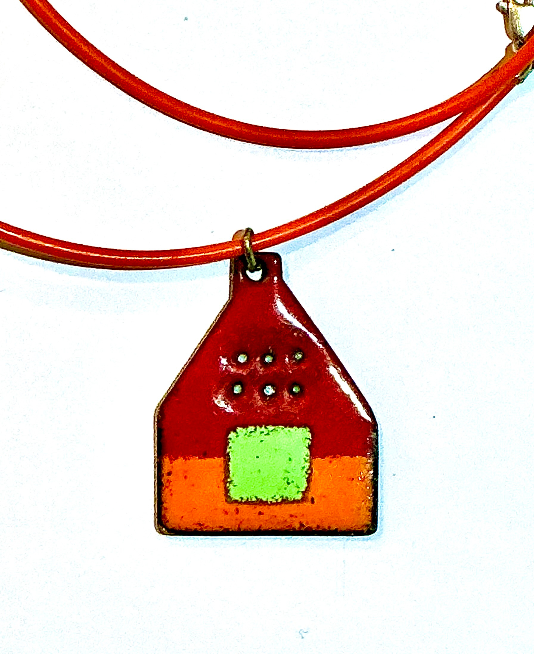
Enamelled copper pendant, No info on maker
Colour Combination
This week’s colours are Tangerine, Lime Green, Deep Red & International Orange. Use them together with neutral lights and darks to create an artwork in any medium or style.
As always, I love seeing what you’ve created. If you’re posting on Instagram, please tag #coloricombo and #estemacleod and join us in the private Facebook group Creative Prompts
Instantly transported to nasturtium land